Links labeled 'Affiliate Link' may earn me commissions — at no extra cost to you. I decide what's worth recommending primarily based on hands-on use, backed by real technical experience and business judgment built in the real world, not a classroom. Most of what I recommend I've used. Where I haven't, that judgment and due diligence cover the gap. Not everything I recommend has an affiliate link — if it's the best option for you, I'll point you to it either way. Content — including text, images, and voiceovers — is created with AI assistance. Here's the deal: my goal is to solve real problems for you — because that's the only version of this that works. Bad recommendations burn trust fast. Good ones compound it. My incentive and yours point the same direction: you need it to actually work. When it does, you come back — and that's how I keep the lights on. So helping you isn't the generous thing to do. It's the only thing that makes sense.

MouseClickTutorials.com
Teaching people how to make websites...
...and how to make websites make money!

.
How to Make Websites and Content
💻 1. Setup > A. Domain / B. Hosting / C. Point Domain / D. WP Users / E. Domain Based Email / [ More in Setup ]
💻.2. Explore > A. WP Dashboard / B. Settings / C. Themes / D. Plugins / E. Widgets / [ More in Explore ]
💻.3. Build > A. Pages & Posts / B. Nested Pages / C. Cats & Tags / D. Menus / E. Try Bricks Builder / [ More in Create ]
💻.4. Create [BRAINSTORMING] >
3. Create > F. Try Bricks Builder
3. Create > F. Try Bricks Builder
Mouse Click Highlights
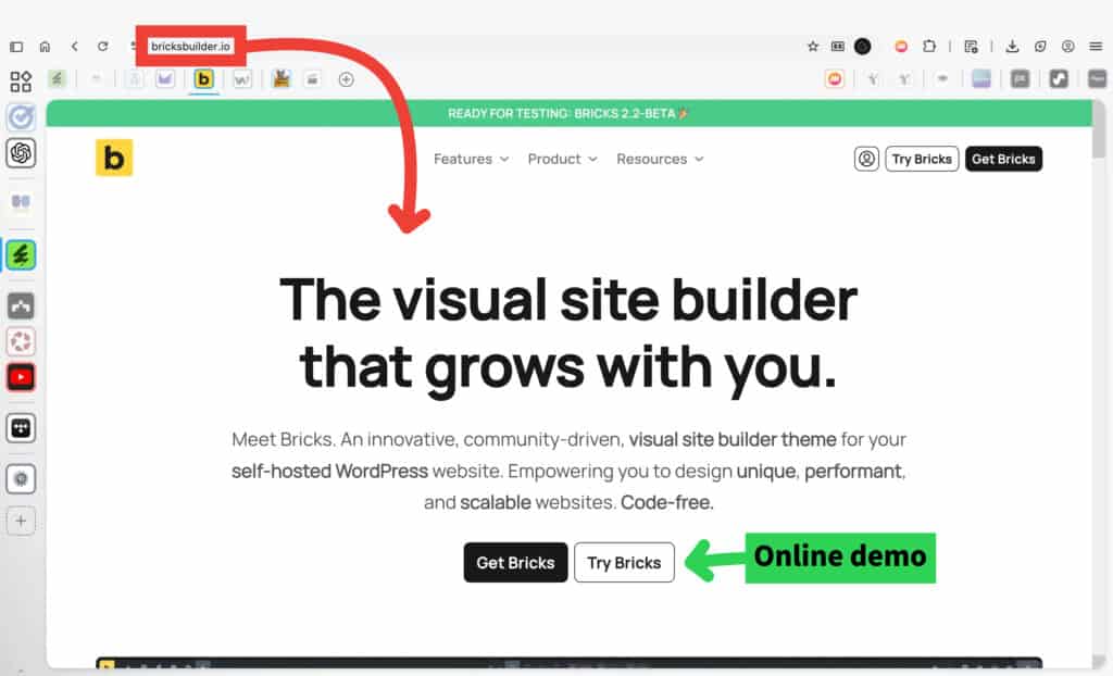
Click Try Bricks to open Bricks Builder in a browser-based demo. This demo lets you explore the editor, layout system, and core features without installing anything on a WordPress site.
The demo is meant for testing how Bricks works, not for building a real website. Because it runs in a sandbox environment, third-party plugins may not load or behave correctly, and changes made in the demo are temporary.
Use the demo to get familiar with the interface and workflow. When you’re ready to use Bricks on an actual WordPress site with full plugin support, a license is required.
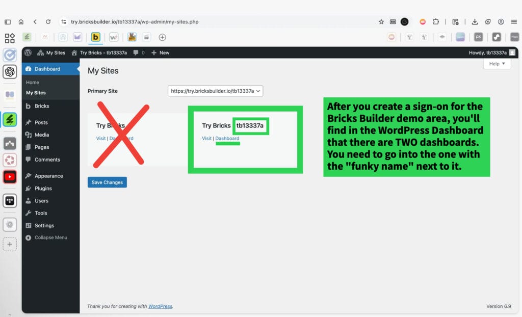
After signing in to the Bricks Builder demo, WordPress shows more than one site dashboard. Only one of them is the actual Bricks demo environment.
Open the site that includes a short, random name next to Try Bricks (for example, a mix of letters and numbers). This is the demo site where Bricks runs and where pages are created and edited.
Ignore the other dashboard. All work in the Bricks demo happens inside the site with the “funky” name.
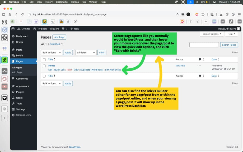
Create pages or posts the same way you normally would in WordPress.
From the Pages or Posts list, hover over an item to reveal the quick options, then click Edit with Bricks to open the Bricks Builder editor.
You can also open Bricks from inside the page or post editor. When viewing a page or post, the option to edit with Bricks appears in the WordPress admin bar.
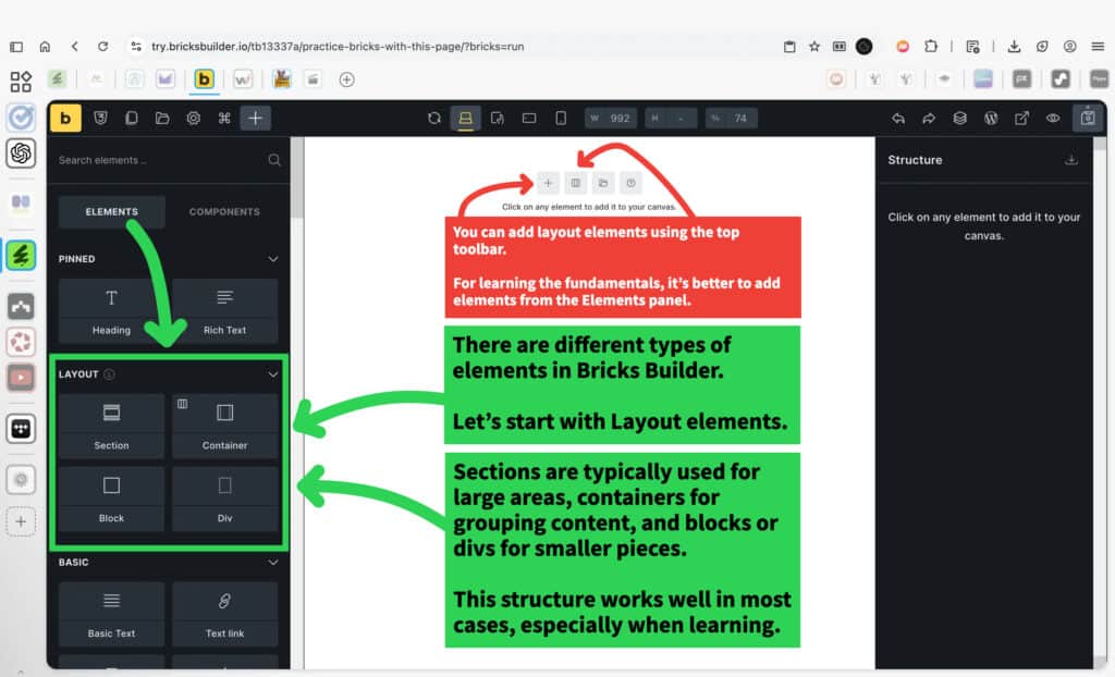
Bricks Builder includes different types of elements, each with a specific role. Start by getting familiar with layout elements, since they control the overall structure of a page.
Layout elements are used to organize content from the outside in. Sections are typically used for large areas of a page, containers are used to group related content, and blocks or divs are used for smaller pieces inside those groups.
Elements can be added in more than one way, but using the Elements panel helps build a clearer understanding of how pages are structured before focusing on styling or fine details.
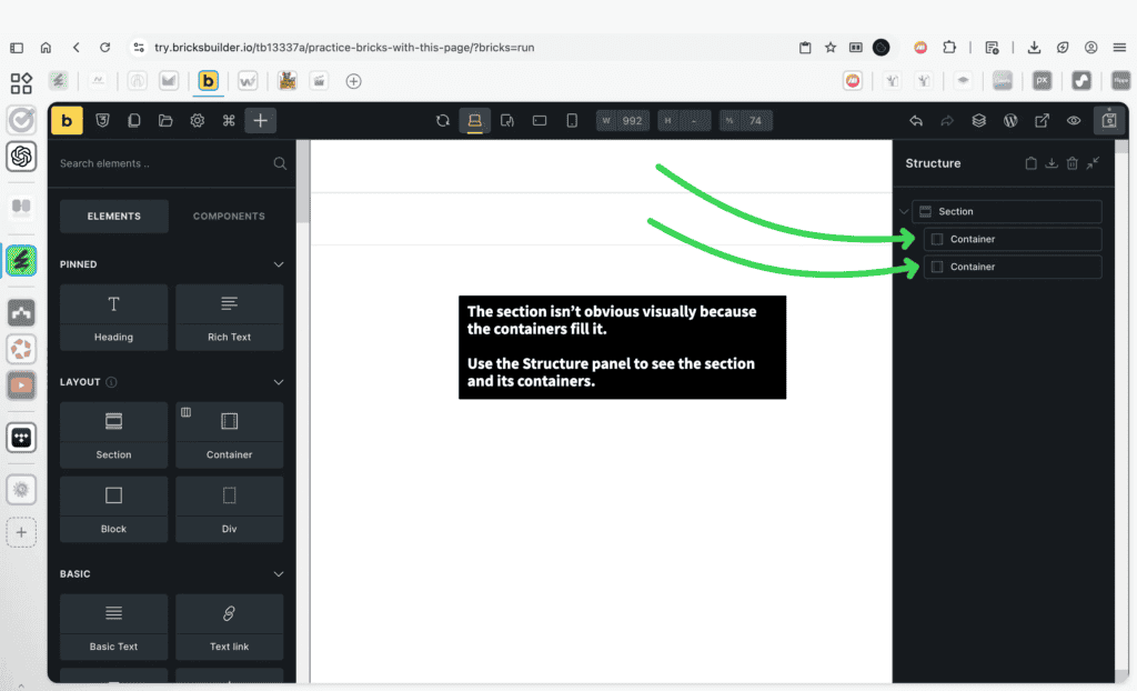
Not every element is obvious on the canvas. In this case, the section isn’t visually distinct because its containers fill the available space.
When something isn’t clear visually, use the Structure panel to understand how elements are nested. This panel shows the actual hierarchy, including sections and the containers inside them, even when boundaries aren’t visible on the page.
Getting comfortable checking structure helps avoid confusion as layouts become more complex.
Select the section first so its settings appear. The active element is highlighted in the Structure panel, which confirms you’re editing the correct level of the layout.
Sections use a flex layout by default. Changing the Direction setting controls how the containers inside the section are arranged—either stacked vertically or placed side by side horizontally.
This setting affects only the selected section. Containers inside the section respond to the direction you choose, which makes this one of the key controls for shaping a page’s overall layout before adjusting spacing or styling.
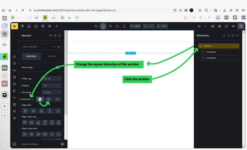
After changing the section’s layout direction, the containers update immediately. Instead of stacking vertically, they now sit side by side across the section.
This happens because containers follow the layout direction of their parent section. Changing the section’s direction is often the fastest way to control whether content flows top-to-bottom or left-to-right.
This visual change confirms that the section is controlling the structure, not the individual containers.

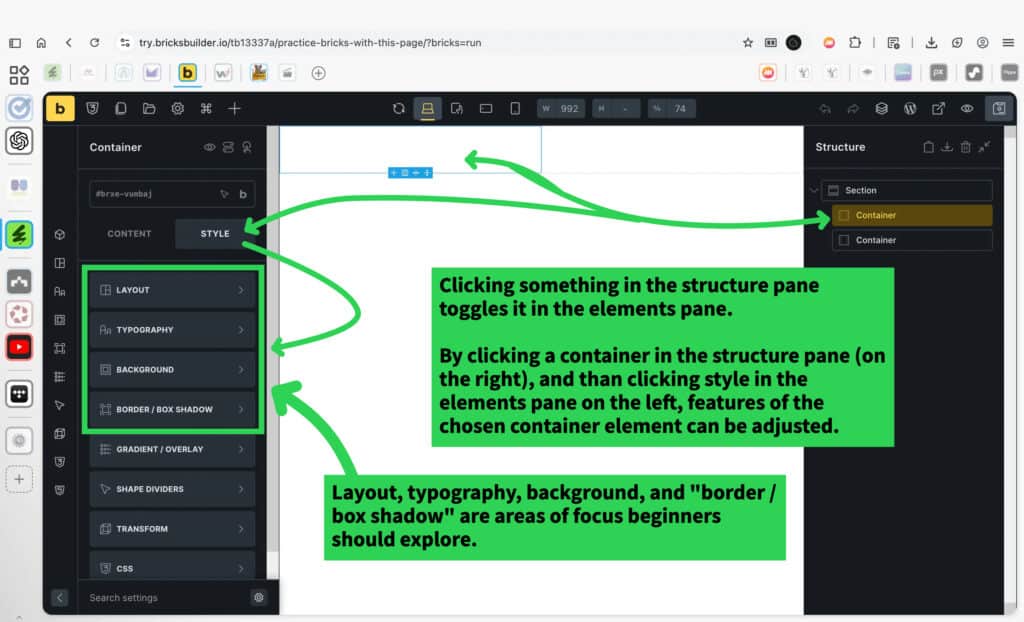
Selecting an item in the Structure panel makes it the active element. Its settings appear in the panel on the left.
The settings panel always includes Content and Style tabs. Bricks automatically switches to the most relevant tab based on what is selected, but both tabs are always available.
The selected item can be a section, container, or any other element. The available options update based on the element type.
For layout elements, start with Layout, Typography, Background, and Border / Box Shadow. These areas cover the most common adjustments and apply consistently as you work through different elements.
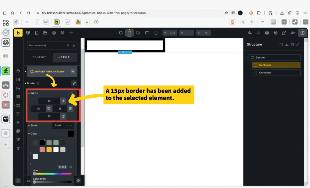
With an element selected, borders are added from Style → Border / Box Shadow. In this example, a 15px border has been applied to the selected element.
Border settings apply to the outside edge of an element and can be adjusted per side—top, right, bottom, and left—either together or independently.
Spacing-related settings are handled elsewhere. Padding and spacing are adjusted in the Layout area, which is one of the key sections worth exploring when working with layout elements. Borders, padding, and spacing work together, but they are controlled in different places.
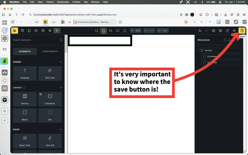
When working in Bricks Builder, it’s important to know where the Save button is located.
The Save button is in the top-right corner of the builder. Use it to save changes as you work and before leaving the editor.
Knowing where to save helps avoid confusion as you move between pages, elements, and different parts of the site.
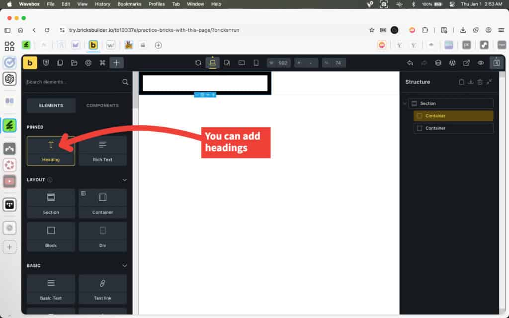
Text elements are added from the Elements panel. Use the Heading element to add titles and section labels to a layout.
Headings are separate from layout elements. They live inside containers or sections and are used to structure content, not page layout. This separation makes it easier to control spacing and alignment without mixing layout and text responsibilities.
The heading element is typically used for page titles, section headings, and other short pieces of text that need emphasis. More detailed text is added using other text elements.
As projects grow, scrolling through the Elements panel can slow things down. Use the search field at the top of the Elements panel to quickly find what you need.
Typing a keyword filters the available elements instantly. This makes it easier to add items like images, text, or other content elements without browsing through every category.
Searching elements is a simple habit that saves time and keeps the focus on building, especially once you’re comfortable with the basic layout and structure.

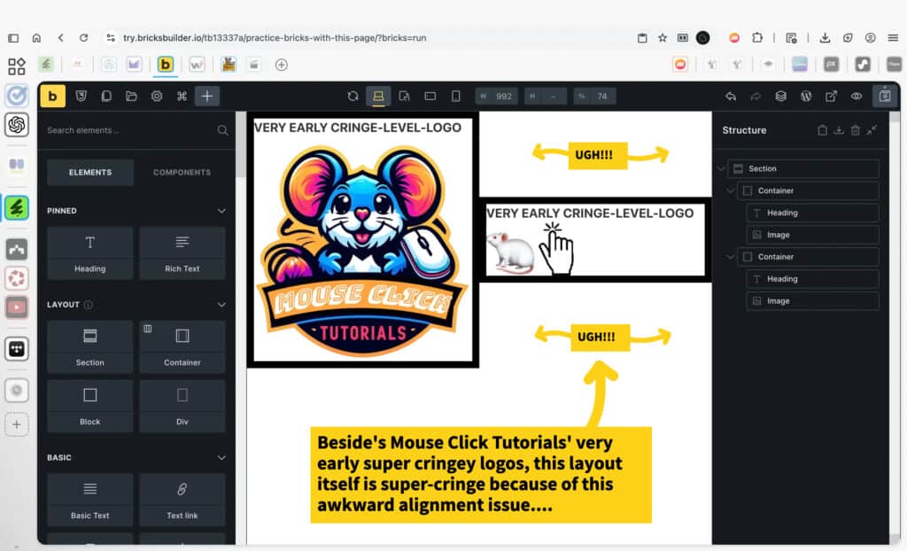
Even when all the right elements are in place, a layout can still feel off. In this example, the content is technically working, but the alignment between elements creates awkward spacing and visual imbalance.
This kind of issue is common when containers are arranged side by side without adjusting alignment, spacing, or sizing. The problem isn’t the images or text themselves—it’s how they’re positioned relative to each other.
Catching alignment issues early makes layouts easier to fix. Once the structure is clear, small adjustments to alignment and spacing can dramatically improve how a page feels without changing the content.
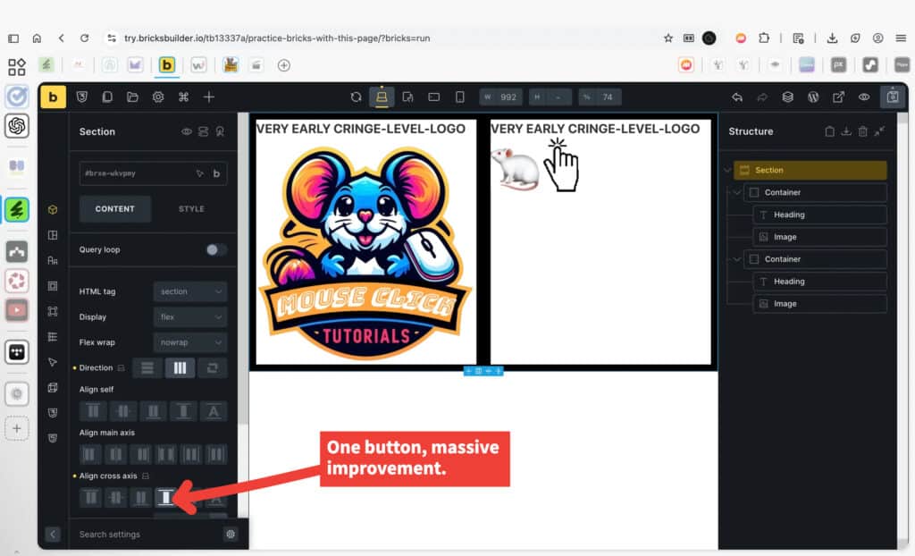
Small alignment changes can dramatically improve how a layout feels. In this case, adjusting the alignment of the containers instantly removes the awkward spacing and makes the design feel more balanced.
Alignment settings control how elements line up within their parent. When containers are arranged side by side, alignment determines whether their content hugs the top, centers vertically, or aligns consistently across the row.
This is a good example of how layout problems are often solved by adjusting alignment—not by changing content or adding more elements. One well-chosen setting can clean up an entire section.
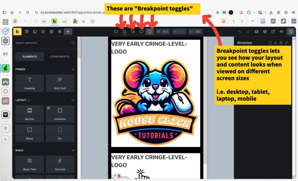
The breakpoint controls let you preview how your layout looks at different screen sizes, such as desktop, tablet, and mobile. Switching between these views doesn’t change your content automatically — it simply shows how elements stack, align, and space themselves at different sizes so you can make adjustments when needed.
This is a quick way to spot layout issues early and make sure your design works well across devices.
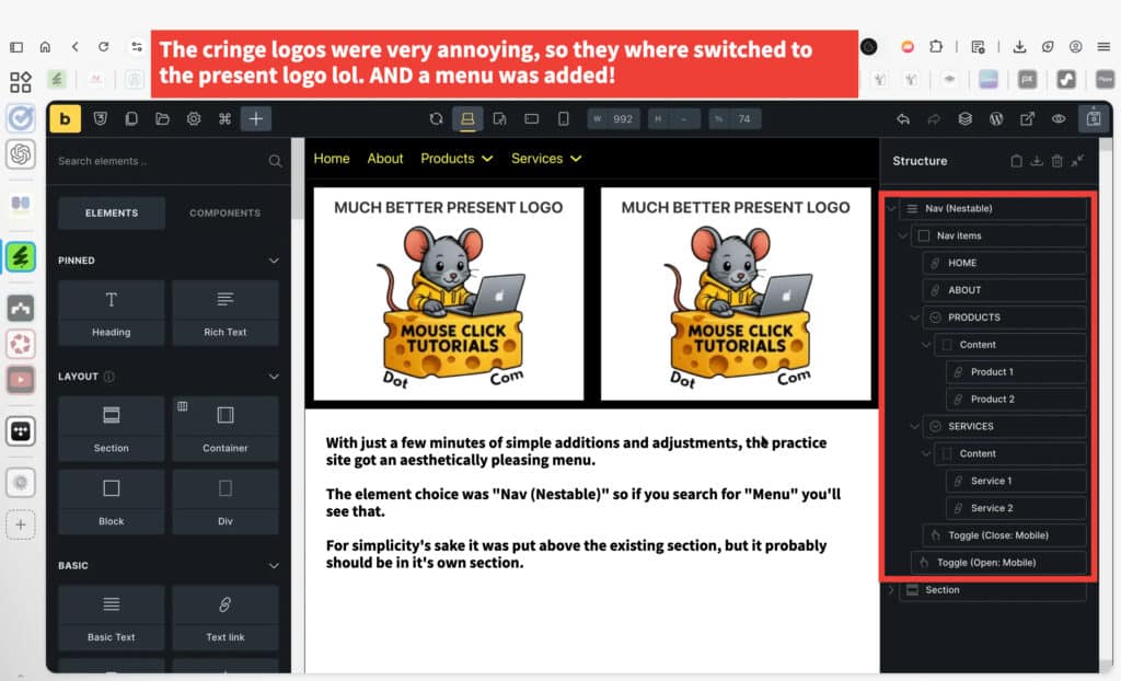
This navigation menu was built manually using the Nav (Nestable) element. It typically starts with a simple structure, such as top-level links and an example dropdown, which you can freely customize.
Using the Structure panel, you can easily duplicate dropdowns, add or remove items, and rearrange the menu hierarchy. If you don’t want dropdowns at all, you can simply delete them. Exploring and adjusting the structure is the fastest way to shape the menu to fit your site.
This approach is different from Bricks’ other menu element, which pulls from WordPress menus. While that option is quicker to set up, the Nav (Nestable) menu offers much more flexibility and control over layout and behavior.
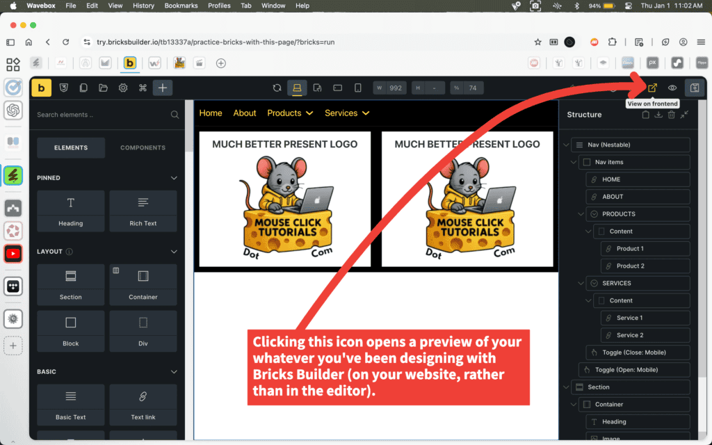
The View on frontend icon opens a preview of the page exactly as visitors will see it on your website. This switches you out of the Bricks editor and loads the live front-end version of the page.
This is useful for checking spacing, alignment, menus, and overall layout without the editor interface in the way. It helps confirm that what’s being built in Bricks looks correct in a real browsing context.
You can switch back to the editor at any time to continue making changes.
This is the front-end preview of the page, showing how the layout appears to visitors rather than inside the Bricks editor.
The page uses a simple, box-based layout. While this style is intentionally basic for teaching purposes, Bricks Builder is fully capable of producing modern, flexible designs with more advanced layouts and styling.
Keeping the layout simple helps reduce distractions and makes it easier to focus on learning how elements are added, arranged, and adjusted. Once the fundamentals are understood, the same tools can be used to create far more polished designs.
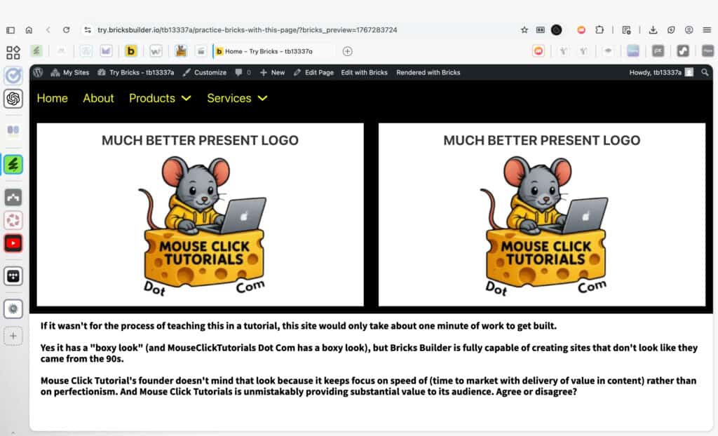
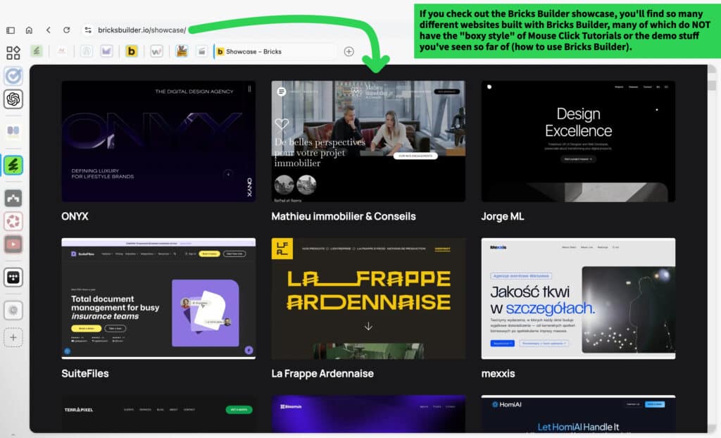
Bricks Builder can create a wide range of website styles and layouts—it’s not limited to the “boxy” look shown in this practice site or used on Mouse Click Tutorials.
To see real-world websites built with Bricks, explore the official Bricks Builder showcase:
https://bricksbuilder.io/showcase/
The showcase highlights different layout approaches, typography choices, spacing techniques, and overall design styles to help you understand what’s possible beyond the demos shown in this course.
The Rich Text element works much like the Classic Editor in WordPress. You can type directly into the content area and use the formatting toolbar to apply bold text, links, lists, alignment, and other basic text styling.
This makes Rich Text ideal for paragraphs, explanations, and longer blocks of written content where simple formatting is all that’s needed—without having to manage multiple text elements.

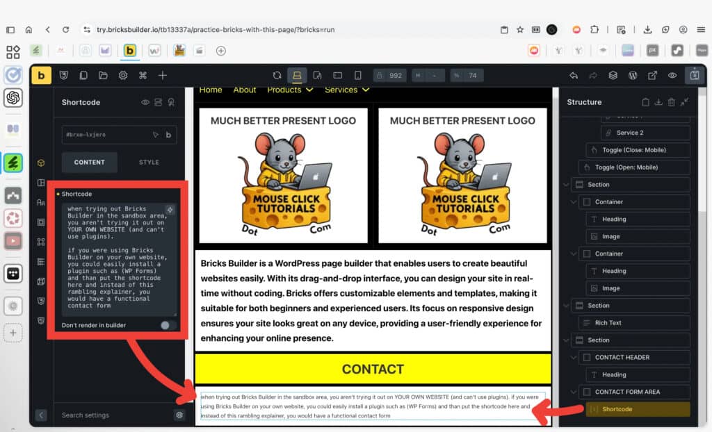
The Shortcode element is used to display output generated by WordPress plugins. It acts as a bridge between Bricks Builder and plugin-based functionality.
In the Bricks Builder sandbox, this element is shown for demonstration only. You’re not working on your own website here, so WordPress plugins can’t run. That’s why this area contains placeholder text instead of interactive content.
On a real WordPress site, you would install a plugin, copy the shortcode it provides, and paste that shortcode into this element. Bricks then renders whatever the plugin outputs—such as forms, dynamic content, or other features—directly on the page.
Commonly used WordPress contact form plugins:
-
Contact Form 7: https://wordpress.org/plugins/contact-form-7/
-
WPForms Lite: https://wordpress.org/plugins/wpforms-lite/
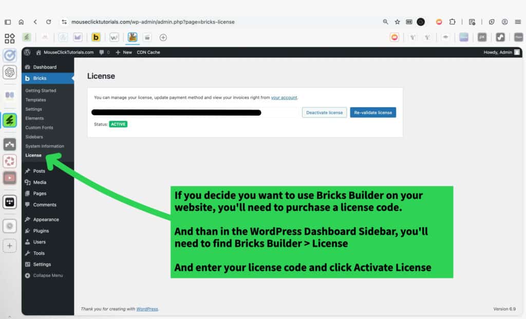
If you decide you want to use Bricks Builder on your own WordPress site, you’ll need to activate a license.
After purchasing Bricks Builder, open your WordPress dashboard and go to Bricks → License in the sidebar.
Paste your license key into the field provided and activate it. Once activated, Bricks Builder is fully unlocked on your site, including access to all features that aren’t available in the sandbox environment.
The sandbox is designed for safe experimentation, but a live WordPress site gives full control over plugins, templates, and long-term site structure. At that point, Bricks becomes part of your actual website—not just a demo.
Try Bricks Builder!
I don't earn commissions from this link
I may earn commissions from this link
Before Buying Online
Before You Buy: Know the (Affiliate Marketing) Industry's Games
Hidden Incentives in Online Recommendations
A lot of content online looks like it’s meant to be helpful. It might be labeled as a review, a list of top picks, or just a casual post like “I found this and it’s cool.” But in many cases, that content isn’t created to help someone make a better decision. It’s created to earn money through affiliate commissions.
What affiliate links are for
Affiliate links exist to support content by allowing someone to earn a commission when a product or service is purchased through a link they’ve shared. That’s the whole purpose. It doesn’t add cost to the buyer—and when used responsibly, it can reward content that genuinely helps.
The problem is how these links influence what gets recommended in the first place.
How incentives distort content
Some affiliate content is shaped by payouts—where higher-paying products and services get pushed harder. But more often, the problem is something else entirely: laziness.
A lot of affiliate content isn’t the result of research or thoughtful guidance. It’s based on whatever’s convenient. A product or service is already popular, someone else is promoting it, or it has an affiliate program—so it gets plugged in without much thought. There’s no testing, no real consideration of what would actually help the audience, and no accountability.
In these cases, the product or service itself might be perfectly fine. But the recommendation isn’t grounded in anything useful, and that’s what creates the disconnect. It leads to content that promotes whatever’s easiest to monetize, skips stronger alternatives that require more effort to discover, avoids mentioning downsides that could reduce clicks, and simply recycles whatever’s already trending among other affiliates.
It’s not about how much something pays. It’s about why it’s being recommended.
A product or service that pays well isn’t the problem if it actually fits the use case. But when it’s included just because it earns—or because it was the easiest thing to grab—that’s not a real recommendation. It’s content that exists to sell, not to help.
How to recognize honest affiliate content
Genuine recommendations feel different. Affiliate links are disclosed openly. Pros and cons are explained clearly, not glossed over. The explanation comes before the link. Alternatives that don’t offer commissions are still mentioned when they’re relevant. And the content doesn’t rely on pressure, urgency, or sales language to get someone to click.
When an affiliate link supports a thoughtful recommendation, it adds value. When the link is the reason something was included in the first place, the integrity of the content falls apart.
How this site handles it
Affiliate links are used here—but never as the reason something gets recommended. Some products and services pay nothing. Others pay less than their competitors. If they actually work, solve a real problem, and serve the audience this site is built for, they get included.
Payouts don’t determine what’s shown. Usefulness, reliability, and fit for the audience do.
Every recommendation on this site includes two links side by side: a clearly marked affiliate link, and a non-affiliate version. That way, anyone who wants to support the site can do so with one click—without being forced into it. And anyone who doesn’t can still access the same product or service without friction.
No popups, no fake scarcity, and no pressure. Just clear information and real options — presented with your time and trust in mind.
How to Choose Web Hosting That Won’t Screw You Later
Why Hosting Choices Can Look Fine at First — and Still Cost You Later
Many web hosting recommendations are influenced by affiliate incentives. That influence often shapes what gets promoted — not based on what’s reliable or useful, but based on what earns commissions. To understand how that works, scroll up to Hidden Incentives in Online Recommendations.
Once that’s clear, it becomes easier to recognize common patterns in how web hosting is sold — especially when it comes to pricing, positioning, and long-term reliability.
What Is Web Hosting, Really?
Web hosting is infrastructure. It’s what keeps a website live, accessible, and functioning smoothly. It stores the site’s files, manages uptime and speed, and often determines how frustrating things get when something breaks.
A good host does its job in the background — quietly, reliably.
A bad host appears fine at first — then slowly drags performance down through downtime, slowness, or support failures.
And often, that decline is masked early on by extra-friendly onboarding.
Sales chat is responsive. Setup support feels hands-on. It’s all about getting the account active and the site online fast. But after that grace period — often right after the refund window passes — service quality shifts.
Some companies do this deliberately: prioritize new customers, while gradually neglecting existing ones.
Others just aren’t equipped to deliver consistent support at scale. Either way, the pattern is common — especially with shared hosting.
Why Shared Hosting Gets Promoted So Heavily
Shared hosting is one of the most promoted types of hosting — not because it’s reliable, but because it’s easy to sell and easy to profit from. Many hosting companies offer shared plans as a low-cost entry point. And many of those companies run affiliate programs where commissions are paid out just for generating a new customer — regardless of which plan the customer signs up for.
That means affiliates often push the cheapest plan available, because it’s easier to convert — even though the payout is the same (or nearly the same) as recommending a better option. A $2.99/month shared hosting plan can still result in a $100+ commission, because the hosting company expects that customer to stick around long enough to cover the cost.
This dynamic is why shared hosting dominates most “best web host” lists — not because it’s actually good, but because it converts easily and pays well.
Why This Site Rejects Shared Hosting Entirely
MouseClickTutorials.com does not recommend shared hosting under any circumstances — not for beginners, not for temporary projects, not for anyone.
Even when managed by capable companies, shared hosting remains too unstable, too crowded, and too limited to serve as reliable infrastructure. It introduces risks and headaches that are completely avoidable with better hosting types. The environment is unpredictable, the performance is inconsistent, and the support is often too generic to be helpful when something goes wrong.
This position isn’t based on theory — it’s based on what actually happens when shared servers are overloaded, misconfigured, or mismanaged. And even without bad intent, it’s incredibly easy for problems to creep in unnoticed. One site’s spike in traffic or bad code can affect everyone else on the server.
Shared hosting is one of the biggest reasons new site owners feel like they “did something wrong,” when the real issue is invisible under the hood. That’s not a foundation worth building on.
The Issue with “Free” Domains
Many hosting companies advertise a “free domain” when signing up for a plan. But in most cases, the domain offer includes conditions:
-
The domain may be registered in the host’s name rather than the customer’s.
-
It may be locked or tied to the hosting plan, making it difficult or expensive to transfer.
-
The domain becomes the anchor keeping people on subpar hosting just to keep their site online.
The fix: always register domains separately with a trusted registrar like Namecheap. That ensures full ownership and makes it easy to change hosts at any time.
Why Cheap Hosting Isn’t Really Cheap
Low introductory prices like $2.99/month are usually misleading:
-
Most require paying 2–3 years upfront to get that rate
-
Renewal rates after the initial term are much higher
-
Core features like backups, SSL, and live support may cost extra — or be limited
-
“Unlimited” plans often include vague usage caps that throttle performance as sites grow
What seems cheap upfront becomes expensive over time — in stress, in missed revenue, and in wasted hours troubleshooting problems that wouldn’t exist on better infrastructure.
And that’s not just a figure of speech. If a site owner spends 40+ hours a year dealing with slow load times, broken features, unclear issues, and back-and-forths with bad support — and if that person would be paid even minimum wage for that time — the true cost of “cheap” hosting becomes obvious.
The value of reliable hosting isn’t just technical. It’s economic. It protects time, momentum, and peace of mind.
Understanding Hosting Types — and Why This Site Only Recommends Some
There’s no universal “best,” but some types of hosting are far better suited for actual website owners — and some should be avoided entirely. Here’s a breakdown:
Shared Hosting
Low-cost, low-quality. Unpredictable performance. Limited scalability.
Often oversold and oversaturated. Even beginners should avoid it.
Managed WordPress Hosting
Built specifically for WordPress. Handles caching, updates, backups, and security automatically.
Fast, secure, and low-maintenance — ideal for most creators, freelancers, and business owners.
This is the default recommendation for a reason.
VPS Hosting (Virtual Private Server)
A private slice of a physical server. More control and flexibility, but also more responsibility.
Best for those with technical experience or specific configuration needs.
Cloud Hosting
Highly scalable and fast — if fully managed. If unmanaged, it can become overly complex.
Great for ecommerce, SaaS, or platforms expecting rapid growth, as long as the host handles the technical side.
Dedicated Hosting
An entire server for one user. Very powerful, very expensive.
Best reserved for advanced use cases with high traffic or strict infrastructure needs.
Colocation
The highest tier — full control over physical hardware inside a rented datacenter rack.
Used for enterprise infrastructure, compliance requirements, or custom network architecture.
Not relevant for most site owners.
What Actually Makes Sense for Most People
For most websites — especially anything built on WordPress — managed WordPress hosting strikes the right balance. It’s fast, secure, and far easier to manage than alternatives that require technical upkeep.
There are more powerful hosting options for those running complex infrastructure or custom apps, but managed WordPress hosting covers the needs of most creators, freelancers, small businesses, and growing projects — without the stress.
The best managed hosts don’t just check boxes. They eliminate problems before they happen.
They don’t disappear when support is needed. They don’t nickel-and-dime for features.
They just make the site work — and keep it working.
That’s the experience most people are actually looking for. And that’s the experience this site teaches people how to build toward.
Defining Your Web Hosting Needs
Hosting Types, Use Cases, and a Reliable Default
Why Your Host Isn’t Just a Checkbox — and What Actually Works for Most People
Most people picking web hosting treat it like a quick checkbox.
Domain, check. Hosting, check. Done.
But your hosting provider determines how fast your site loads, how often it breaks, how secure it stays, and how painful things get when something goes wrong.
It’s infrastructure — not a formality.
And one type of hosting still gets pushed far too often — especially by affiliate blogs chasing easy commissions.
Shared Hosting
This is where MouseClickTutorials.com draws a hard line.
Shared hosting is the $2.99/month pitch that sounds beginner-friendly… but quietly causes more damage than most new site owners can spot. Your site gets dropped into a crowded server with hundreds or thousands of others, all fighting for the same limited resources.
If another site spikes in traffic or runs unstable code, your site slows down — or goes down.
Support is slow, vague, and scripted.
Problems get blamed on you, with upgrade nudges as the default fix.
It often looks fine at first. That’s the problem.
When your site slows down or glitches later, you assume it’s something you did wrong.
But it’s not. It’s the hosting.
This site does not recommend shared hosting. Not for beginners. Not for anyone. Not ever.
Managed WordPress Hosting
This is the recommended path for most people building on WordPress.
Managed WordPress hosting is built to remove technical headaches. It handles backups, caching, updates, and security automatically — so you don’t need extra plugins just to keep things stable. The best providers offer fast performance and platform-aware support teams who actually know WordPress.
It’s low-maintenance. High-reliability.
And it’s the default recommendation here because it actually works.
VPS Hosting
A virtual private server (VPS) gives you more control and power — but also more technical responsibility.
You manage server setup, patches, security, and updates.
It’s great for developers and experienced users.
It’s not ideal for beginners or creators who want to focus on building content, not managing infrastructure.
Cloud Hosting
Cloud hosting can be powerful, scalable, and efficient — if it’s fully managed.
Otherwise, it comes with complexity most people don’t want.
Server configuration, cost optimization, scaling logic — it’s easy to get lost in the weeds unless the platform handles those pieces for you.
Used well, cloud hosting is a strong choice for fast-growing platforms, ecommerce sites, or custom apps. But for a first site or general-purpose WordPress site, it’s often overkill.
Dedicated Hosting
Dedicated hosting gives you your own physical server — with total control and no resource sharing.
It’s powerful and expensive, and usually reserved for specialized use cases: high-traffic apps, large media platforms, or advanced infrastructure stacks.
It’s not the place to start unless you already know exactly why you need it.
The Reliable Default
For most people using WordPress — creators, freelancers, educators, business owners — managed WordPress hosting is the most useful path forward.
It’s fast. It’s secure. It scales without stress.
And it keeps your site online, protected, and supported — without you needing to touch the backend.
That’s what this site recommends.
That’s what this site teaches.
Because it actually works.
Why Rocket.net is Recommended for Managed WordPress Hosting
1. Specialized WordPress Hosting: Why Rocket.net is a Perfect Fit
2. Blazing Fast Performance: Why Rocket.net Prioritizes Speed
3. Comprehensive Security: Why Rocket.net Protects Your Site
4. Hassle-Free Management: Why Rocket.net is Easy to Use
Check out the complete setup tutorial here →
Commissions will not be earned from this link.
*Not Monetized
Commissions will not be earned from this link.
*Not Monetized
Commissions may be earned from this link.
*Monetized
When Managed Hosting Isn’t Enough
Other Hosts to Consider
Rocket.net is the recommended starting point for most users — it’s fast, secure, and built specifically for WordPress. It handles speed, stability, and security without overwhelming you with backend tasks.
But if you’re building something more complex, running multiple applications, or just want to understand what else is out there, here are a few other hosts worth knowing about.
These hosts are grouped by how much control and infrastructure complexity they offer — starting with other options in the same managed WordPress category, then expanding into VPS, full-stack platforms, and finally, enterprise-level hosting.
Managed WordPress (Same Tier, Different Strength)
Templ.io
Templ.io is another managed WordPress host — in the same category as Rocket.net. While Rocket.net is the top recommendation here, Templ.io stands out for one reason: their support team is more willing to assist with technical issues at the code level.
If a plugin breaks layout or a script throws an error, they may help you investigate what’s going wrong. They won’t write your code, but they’ll go deeper than most.
Use if you want managed WordPress hosting with an extra layer of technical support — without leaving the simplicity of this hosting tier.
Managed VPS (More control, broader use cases)
KnownHost
KnownHost gives you full server-level access through managed VPS hosting. You can install custom software, run multiple apps, configure email, and handle more advanced workflows than a WordPress-only host would allow.
Some plans still use cPanel, while others may include DirectAdmin — check the specifics before choosing.
Use if you’re managing more than just a WordPress site, or need flexibility that managed WordPress doesn’t offer.
Managed VPS (cPanel-focused, long-term scalability)
Hivelocity
Hivelocity offers managed VPS hosting with strong cPanel support, full root access, and upgrade paths into dedicated servers or colocation — all without locking you into a proprietary dashboard.
You’re not limited to WordPress, and you don’t need to give up traditional tools.
Use if you want a cPanel-friendly platform with the freedom to run mixed environments — and the ability to scale far beyond VPS later if needed.
Cloud-Native Performance Hosting
Servebolt
Servebolt doesn’t follow the VPS/cPanel playbook. It’s built from the ground up for speed — especially for dynamic sites like WordPress or WooCommerce.
They manage performance at the stack level: memory allocation, rendering optimization, backend tuning — all handled by their proprietary infrastructure.
Use if you’re running a high-traffic or ecommerce-heavy site where raw speed is a top priority and you’re okay with skipping traditional server tools.
Dedicated Servers (Unmanaged, full control)
Hetzner
Hetzner is known for high performance at extremely competitive prices — especially in the EU. They offer both dedicated hardware and cloud instances, but everything is self-managed. No hand-holding, no support for setup or configuration.
It’s powerful, but entirely your responsibility.
Use if you know what you’re doing and want total ownership of your environment for speed, scale, or regulatory control.
Colocation (Enterprise-grade physical infrastructure)
Colocation Providers
Colocation means you own the hardware. You rent rack space in a datacenter — they supply power, cooling, and bandwidth, but everything else is up to you.
This isn’t a web hosting plan — it’s raw infrastructure.
Used by SaaS companies, media platforms, and organizations with strict compliance, latency, or scaling needs.
Providers in this space include Hivelocity, PhoenixNAP, Equinix, Digital Realty, ColoCrossing, and OVHcloud.
Use if you already know exactly why you need this. If you’re not sure, you don’t.
Recommended Resources Review Process
Traffic Light Rating System: Overview
Recommended resources are rated using a system inspired by traffic lights. This system makes it easier to find what’s actually useful for building websites, streamlining workflows, and boosting productivity across different areas. Resources are evaluated for their quality, reliability, and how much they benefit MouseClickTutorials’ audience.
Green Light resources are intentionally few. Very few resources are truly Green Light worthy, and from those, only a small mix is chosen. That’s deliberate — people only have so much time, energy, and money, so this tier exists to serve the best interests of MouseClickTutorials’ audience. If a resource appears here, it’s because it delivers proven value for those learning and building along with this site.
Yellow Light resources are also excellent, but not all are meant for the very top. Most wouldn’t make the cut for Green Light, though a few could. Their placement here doesn’t take away their value — it reflects the balance between curation, context, and the need to keep Green Light small and focused. Yellow Light provides more worthwhile resources that can still help this audience, without stretching the top tier too far.
Why No Red Light Resources?
There’s no “red light” category here. Low-quality or harmful resources aren’t listed at all. This approach is intentional, for a few reasons:
-
Practicality: Listing every bad product or service would flood the site with noise and make it harder to spot what’s actually valuable.
-
Liability: Calling out poor options by name risks legal issues like defamation. Focusing on trusted recommendations avoids that problem.
-
Awareness: In other parts of the site, industries like web hosting and affiliate marketing are explained in depth — so readers learn how to avoid pitfalls and spot shady practices without needing a blacklist.

Green Light Resources
Wavebox
Wavebox
Wavebox
Commissions will not be earned from this link.
*Not Monetized
Commissions will not be earned from this link.
*Not Monetized
Commissions may be earned from this link.
*Monetized
ChatGPT
ChatGPT
ChatGPT
Commissions will not be earned from this link.
*Not Monetized
Commissions may be earned from this link.
*Monetized
Namecheap
Namecheap
Namecheap
Commissions will not be earned from this link.
*Not Monetized
Commissions may be earned from this link.
*Monetized
Rocket.net
Rocket.net
Rocket.net

Commissions will not be earned from this link.
*Not Monetized
Commissions may be earned from this link.
*Monetized
Bricks Builder
Bricks Builder
Bricks Builder

Commissions will not be earned from this link.
*Not Monetized
Commissions may be earned from this link.
*Monetized
Envato
Envato
Envato
Commissions will not be earned from this link.
*Not Monetized
Commissions may be earned from this link.
*Monetized
Canva
Canva
Canva
Commissions will not be earned from this link.
*Not Monetized
Commissions may be earned from this link.
*Monetized
ScreenFlow
ScreenFlow
ScreenFlow
Commissions will not be earned from this link.
*Not Monetized
Commissions may be earned from this link.
*Monetized
Davinci Resolve
Davinci Resolve
Davinci Resolve
Commissions will not be earned from this link.
*Not Monetized
Commissions will not be earned from this link.
*Not Monetized
Fileside
Fileside
Fileside
Commissions will not be earned from this link.
*Not Monetized
Commissions may be earned from this link.
*Monetized

Yellow Light Resources
Content goes here .. (1)
Content goes here .. (2)
Chathub.gg
by _____
url _____
Designed to support multiple AI chat models in one place, this platform is particularly useful for comparing responses from different models or avoiding rate limits. Users can view up to six prompt windows simultaneously, allowing for the exploration of various models on the same screen. While only one prompt can run at a time, the ability to send a prompt and skim through responses that have already landed enables a more dynamic workflow. This feature is especially beneficial for those in a hyper workflow mode, as it helps maintain creative flow. Users can quickly switch between prompts and ideas, making it easier to iterate rapidly. Although the primary use case is for comparing responses from different AI models, the platform also supports users who thrive on taking swift action and keeping momentum in their creative processes.
Content goes here .. (2)
Content goes here .. (2)
Content goes here .. (2)
Content goes here .. (2)
Content goes here .. (2)
Content goes here .. (2)
Content goes here .. (2)
Content goes here .. (2)
Content goes here .. (2)
Content goes here .. (2)
Content goes here .. (2)
Content goes here .. (2)
Content goes here .. (2)
Content goes here .. (2)
Content goes here .. (2)
Content goes here .. (2)
Content goes here .. (2)
Content goes here .. (2)
Content goes here .. (2)
Content goes here .. (2)
Content goes here .. (2)
Content goes here .. (2)
Content goes here .. (2)
Has this website helped you?
If you found this site useful, please tell others! 🙏
The content on MouseClickTutorials.com is built with an obsessive focus on clarity, purpose, and respect for the reader’s time. Tutorials are crafted to support real progress: setting up the essentials, understanding digital stuff works, choosing reliable products and services, building a site aligned with personal goals, and learning how to earn ethically online.
If something here proves useful, feel free to share it with others who might benefit. Whether it’s a single page or the entire site, thoughtful recommendations help valuable resources reach more people trying to build online with integrity.
No email newsletter. No pop-ups. No “sign up to unlock.” That choice is intentional.
Forced funnels, artificial urgency, and inbox campaigns dressed up as generosity are not part of this model. Content remains fully accessible—no gatekeeping, no gimmicks—because real value shouldn’t come with strings attached. Trust is earned through usefulness, not pressure.
For those studying online marketing, this approach may be worth exploring. Sustainable growth often comes from delivering honest content, making ethical recommendations, and focusing on long-term relationships—not short-term conversions.
Thanks for reading, for thinking critically, and for helping shape a better web.
Contact MouseClickTutorials